Re-imagining the Notes Feature on Coursera

In this self-initiated solo project, I redesigned the notes feature on Coursera. Based on a qualitative interview I conducted, I strived to improve the notes feature by adding further emphasize on screenshots so that users could easily retrieve and overview information.


Re-Imagining the Notes Feature on Coursera

Re-Imagining the Notes Feature on Coursera

Overview

Problem/ Challenge

Re-imaging the functionality of the Note Taking feature on Coursera. 

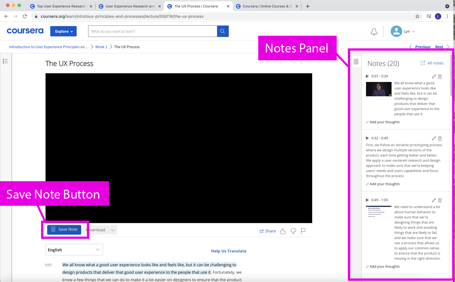
The Notes Feature needs to be redesigned based on the findings of a qualitative interview I did. The findings indicated that the “Notes Button” and “Notes SideBar” components of the Notes Feature is poorly understood, unintuitive, and has low user engagement. 

Thus I aimed to improve the Notes Feature’s:
  • Usefulness/ Value
  • Usability
  • User Engagement

Description of Product

Coursera is an online learning platform that offers users the opportunity to explore a variety of different courses and even offers degrees or specializations. Users may use the platform for pure curiosity of learning as well as a means to advance their career.

Scope

The Notes Feature is available on every Course Content Video page. The Notes Feature is composed of various components, such as highlighting, the “TakeNotes” button and the left hand panel.  

For the purpose of this project I decided to focus my attention on the UI of the Video, the Notes Button, and the Notes Panel.

Design Thinking Process

Design Outcome

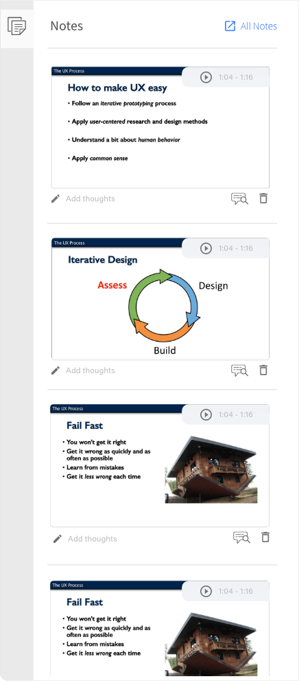
Visibly Readable Slides
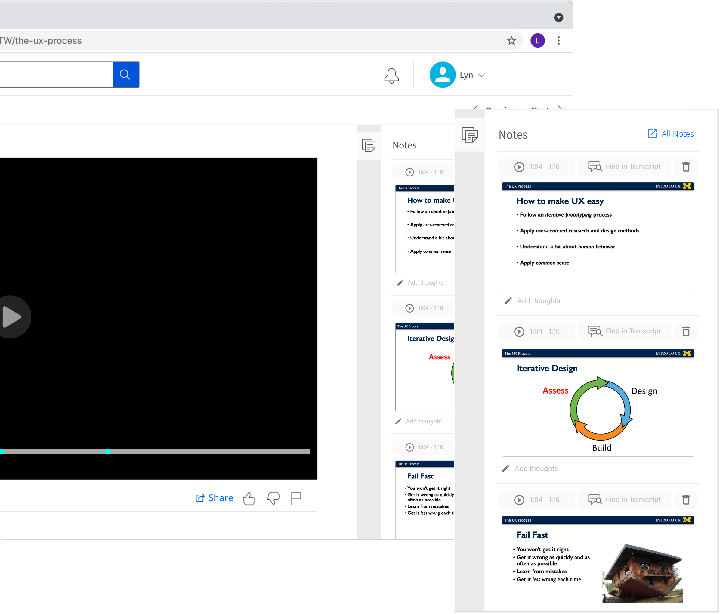
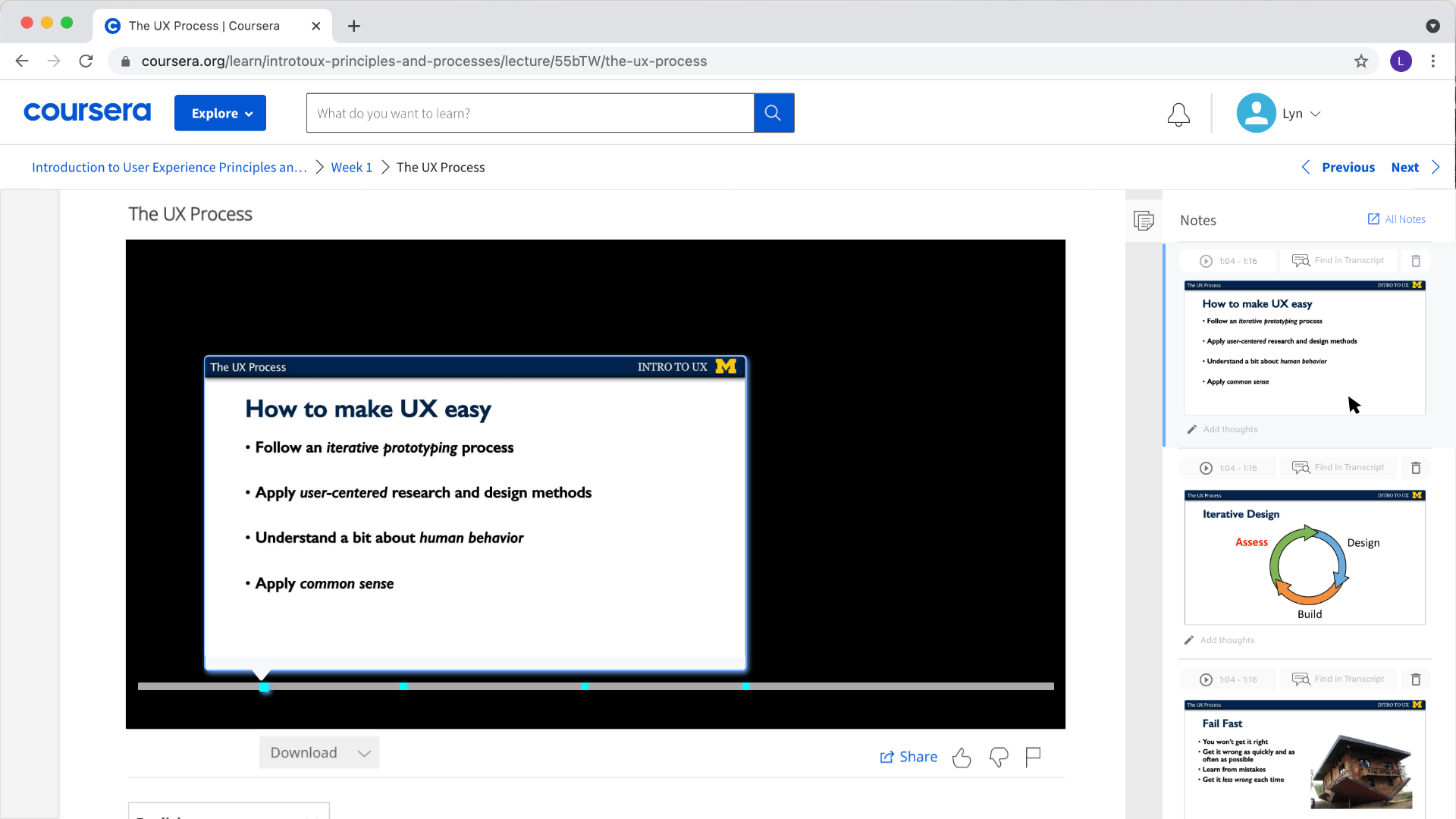
The user is able to easily look at the Notes Panels and browse through the screenshots. The screenshots are large enough for the user to read. Making skimming easy!

Note:  I only redesigned the right hand panel content. The rest of the items on the website remain as I found them on the original site.
Enlarged Image on Hover
For an even closer look, the image is enlarged on hover, over the video interface

Research

I conducted a qualitative interview and a literature review to help shed light on user needs and note taking. The qualitative interview was explorative. It also provided inspiration for potential redesigns.

Qualitative Interview

Qualitative interview gave rise to a new way of redesigning the notes feature
Informed me of a potential new feature
Points to a causal explanation as to why people don't use the notes feature

Approach

Research Method

Semi-Structured Interview
& Observation

Data Analysis

Affinity Wall
(Thematic Analysis
& Recursive Abstraction)

I conducted a semi-structured Interview and observation with 3 Coursera users. The qualitative interview set out to uncover the users experience with the various features on the Course Content Video webpage (not just the Notes Feature). It also hoped to shed insight on what features are useful or frustrating during the learning experience(watching the video), and if the features hinder or help their learning process. The findings were analyzed via an Affinity Wall.

Relevant Findings

Finding
01
Users have other means of note taking and preferences that explain why they didn't use the notes & highlight feature.
Quotes
“Highlighting doesn’t work for me, I just end up highlighting everything”

“I didn’t engage with the notes feature because I prefer taking handwritten notes”
Overview
Participants prefer and like other means of note taking.

Users reported taking:
  • handwritten notes
  • notes on a google document
Significance
  • Users who already have existing means of note taking may be less likely to explore a feature called "Notes"
  • Notes feature shouldn't aim to replace but to supplement existing means of note taking methods / processes.
    (for example a user described returning to a video just to find a specific screen to screenshot in order to place into her documents)
Can potentially improve value & user engagement
Finding
02
Though a preference for other means of note taking exists, the notes panel on the webpage is still considered unintuitive and confusing
Quotes
“Immediately after trying it I was like nope”
“I did not figure it out and just decided to take handwritten notes” 

“The time thing I don’t know... I just don’t like the setup in general. I don’t think the time is important… my mind just doesn’t work like that… I was just like no thank you…”.
Overview
  • Users quickly lost interest in the notes features expressed dislike of it, and that it was not inuitive
  • Visual presentation of the data on the left hand panel is not well received
    • The time not being intuitive to note taking
    • Screenshots holding useless and unreadable information
Significance
  • Poor implementation of the notes feature is a competing reason for the features lack of use
  • Presentation of the data on the left hand panel needs to be changed
    • Time stamp shouldn't be the first piece of information seen/ be less emphasized
    • Screenshots should be readable
    • Separate data items ( screenshots and dialogue) to prevent a situation where a note is holding insignificant data
Reference
Can potentially improve usability
Finding
03
Though incredibly useful and helpful, users pause and rewind excessively for short videos and for a particular individual it did not seem to benefit her retention of the information.
Does the pausing feature cause users to take verbatim notes instead of generative notes? (generative notes are more conducive to conceptual understanding/learning)
Quotes
“I never watch it all the way through in one sitting”
“I pause almost every time I am taking notes”

One specific user describing her behavior while watching a coursera video
“It was a lot of going back then writing, looking… and then again rewinding, writing notes, and then looking…because I loose my train of thought”  

“But I retained very little information from writing it down… I failed the quiz…The information didn’t go through I was just writing it”
Overview
  • All users described their habit of pausing and rewinding for videos as "alot"
  • All users reported pausing primarily to take notes
  • only 1 user reported issues with information retention (failing her quiz)
Significance
  • Promoting effective & efficient means of note taking and learning
  • Frequency, severity, and extent of potential issue is unknown
    • User's may be passing quizzes but long term retention may be weaker due to verbatim note taking this may be detrimental to job seekers/career changers
Can potentially improve value
Finding
04
Users could be using the take note button to take/save screenshots with less effort but they aren’t. Why?
Quotes
“I don't actually know how to use the notes feature"
What we know
  1. All users reported liking and taking manual screenshot (CMD + opt + 4) to save as examples
  2. Currently the “Take Note” button saves a screenshot to the right hand notes panel along with other data points (portion of transcript in the form of a quote, and a time stamp)
  3. None of the users reported using the “Take Note” button
We can see that taking screenshots is a user need and a functionality that is supported by the “Take Note” button but it isn’t being used.
Why didn't they use the feature, if it supports a functionality they are doing? (screenshoting)
  1. Users did not explore the notes feature and are thus unaware of its functionality
  2. Users quickly lost interest in the notes feature expressed dislike of it and that it was not intuitive
low probability of adoptability based on the users dislike of it and quick abandonment
Significance
  • Love for screenshots/taking screenshots is a user need
  • Change icon & language of notes feature to speak to the user need (screenshotting)
    • prompt more users to try the feature
  • Reduce perceived overlap between features
    • seperate the screenshotting and text
  • Supplement existing means of note taking don't replace it
Can potentially improve value & usability
Literature Review

I looked into relevant studies regarding note taking and learning.
Finding
01
Generative note taking is far more effective for learning and conceptual understanding than verbatim note taking.
Verbatim note taking is transcribing word for word. Generative note taking involves summarizing, paraphrasing, etc.
Overview
  • Students in a classroom setting who took notes on laptops performed worse on conceptual questions than those who took handwritten notes
  • Why? Laptop notetakers have a tendency to transcribe lectures verbatim rather than generatively(which requires the person to process the information and reframe it into their own words)
  • Even when laptop note takers were instructed to not take verbatim notes, they still did
  • Taking long handed notes also has greater benefits for enhanced external storage
  • Taking handwritten notes & generative note taking is superior
Significance
  • Our Qualitative interview may hint at the possibility that online learning with pre-recorded videos may be promoting more verbatim note taking due to the ability of the user to pause and rewind. (All users said they paused for note taking purposes.)
    While only one user reported not passing their quiz, this may hint at to why. Also if users are truly taking more verbatim notes than generative notes then it's possible that conceptual and long term retention of the information is weaker.
  • Conceptual understanding may be more easily forgotten long-term (even if users pass quizzes) if users are taking verbatim notes
  • Important to keep in mind. Aim to create a solution that promotes betters note taking or learning.
The Pen is Mightier Than the Keyboard: Advantages of Longhand Over Laptop Note Taking
Finding
02
Highlighting & Re-reading are illusions of learning/mastery
Highlighting, underlining, and poring over notes/texts are the most used study strategies yet they are ineffective for learning and durable memory.
Overview
  • “Doing multiple readings in close succession is a time consuming study strategy that yields negligible benefits at the expense of much more effective strategies that take less time. Yet surveys of college students confirm what professors have long known: highlighting, underlining, and sustained poring over notes and texts are the most used study strategies by far” Make it stick, The science of succesful learning
  • Multiple readings in close succession does not actually help with learning or durable memory
  • Familiarity with text can create an illusion of mastery
  • Re-reading a text is beneficial when a meaningful amount of time has passed since the first reading
Significance
  • Most people have ineffective study strategies, all the more reason to promote effective learning
  • Should the highlighting feature be eliminated?
    • No, it can still serve a purpose but it should be given lower priority
    • Can be used to find information at a later time
  • Our memory isn’t perfect, so it will be important for users to be able to go back and quickly find a topic they were looking for, especially for people who are switching industries
Make it Stick, The Science of Successful Learning
Finding
03
Information retention may be weaker on Online Learning
Information retention may be weaker on online pre-recorded lectures and even online texts not because of mind wandering, but potentially spatial context.
Overview
  • Students showed better memory recall in live lectures than pre-recorded ones. There was no great difference between mind wandering in either format.
  • More repeated testing and repetition may be needed to digest material fully from an online text versus a book
Significance
  • If we are retaining less and remembering less online, maybe we should make it easy to go back and easily find information
  • and / or we can try to promote more effective memory retention via notes panel
Memory for Lectures: How Lecture format impacts the learning experience
Do E-books Make It Harder to Remember What You Just Read?

Additional Considerations

In an ideal world I would have access to user behavior and analytics to juxtapose the qualitative interview findings. In this case I would have checked:
·  frequency of users who actually utilize the “Take Notes” button
·  # of users who use the highlight feature
·   # of users who actually use/interact with the right hand notes panel
Why important:                        
To support the notion that it has low user engagement.
In juxtaposition with the qual interview it can explain potentially why users aren’t using it

· Users who have never tried the “Take Notes” button
· Users who have tried the “Take Notes” button but seemingly never used it again  
· Frequency that users screenshot parts of the video
· # of videos that contain powerpoints, or pre-written notes  
· # of users who frequently pause, rewind
o  If many people do this, then investigate if people are actually taking more verbatim notes  

For Further investigation
· Are users actually taking more verbatim notes instead of generative?
· Are users retaining less information via online pre-recorded courses?
· Are users more likely to forget long-term what they learned via the online courses?
· Are users having issues finding previously learned information from the videos when reviewing?
o  If users do have issues remembering long-term, and they decide to review information they already learned are they having trouble finding where to find that information.

Summary

Hypothesis: its may be more difficult to retain information online via a pre-recorded video. Not just because of potential distractions but for other reasons as well, like the increased likelihood of verbatim note taking and lack of spacial context.
Some users may be taking verbatim notes instead of generative notes, this may in turn effect their ability to retain a long-term conceptual understanding of the material
Most people have ineffective study strategies. Highlighting and poring over notes are the most used study methods yet they aren't very effective for learning and durable memory
Notes feature shouldn’t aim to replace but to supplement existing means of note-taking.
Presentation of the "Notes" data on the left hand panel needs to be improved. User's disliked the notes feature.
Users like to screenshot! Make changes to the notes button and functionality to better serve this user need

Design

Ideation

Brainstorming & Sketching

Based on the research, I decided to focus on these main issues:
Easily screenshotting/retrieving screenshots as a user need
Icon & Language of the notes feature should speak to the user need (screenshotting)
Present the notes data (left hand panel) in a meaningful and easy to skim way
Supplement their learning experience
Make it easy for users to return at a later point and quickly find information
Promoting effective & efficient means of note taking and learning

Design Alternatives

Concept 1

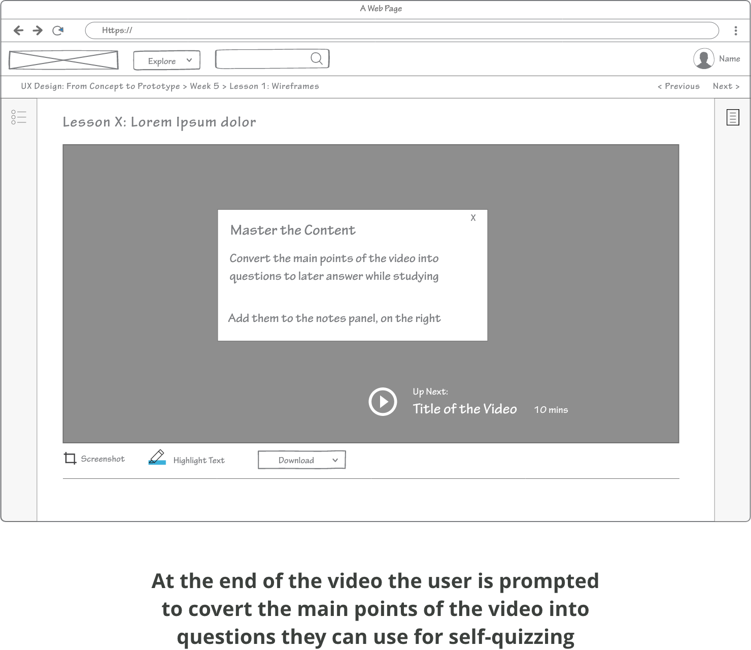
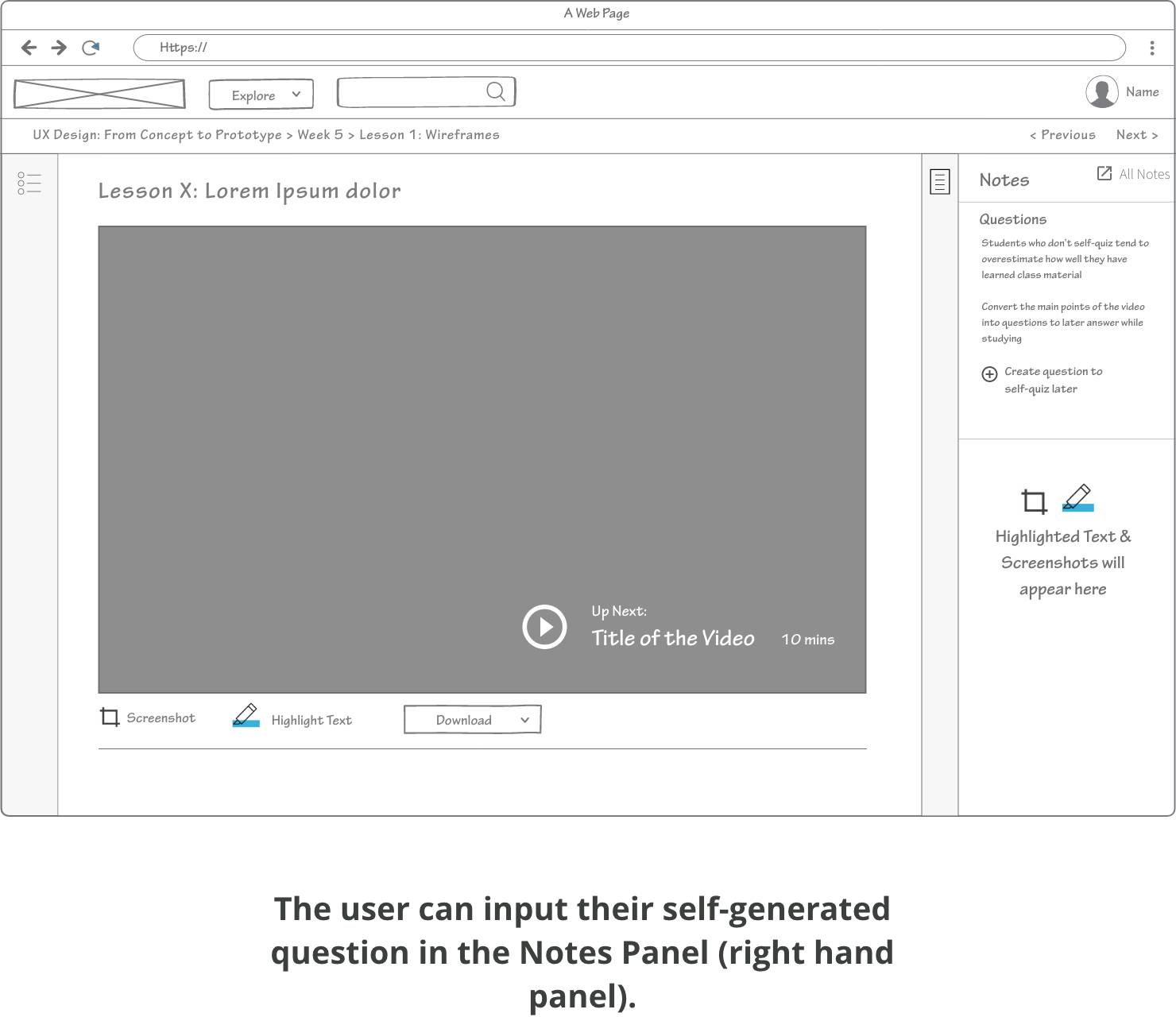
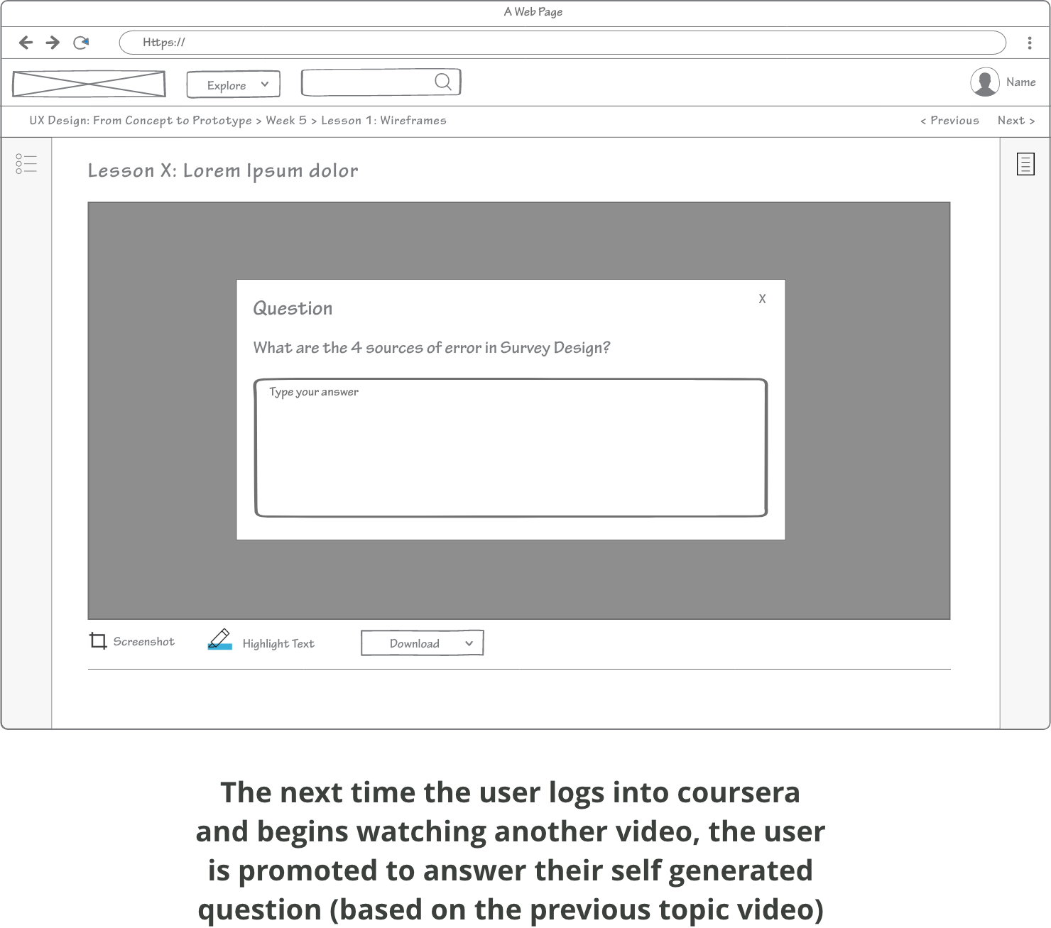
Students often engage in ineffective study methods thus I aimed to promote a means to help users engage in more proactive studying. I did this by adding a section in the notes panel where students could hold questions that they create after watching a video to self quiz. Another alternative could be that the instructors provide more quiz questions in between and after videos ( range of open-ended and multiple choice). Another variation is that the community could create questions.

Questions that summarize the main concepts of the videos can be used for self-testing later. The system could prompt the user at a later time. Interweaving is an effective means of learning.

Concept 2

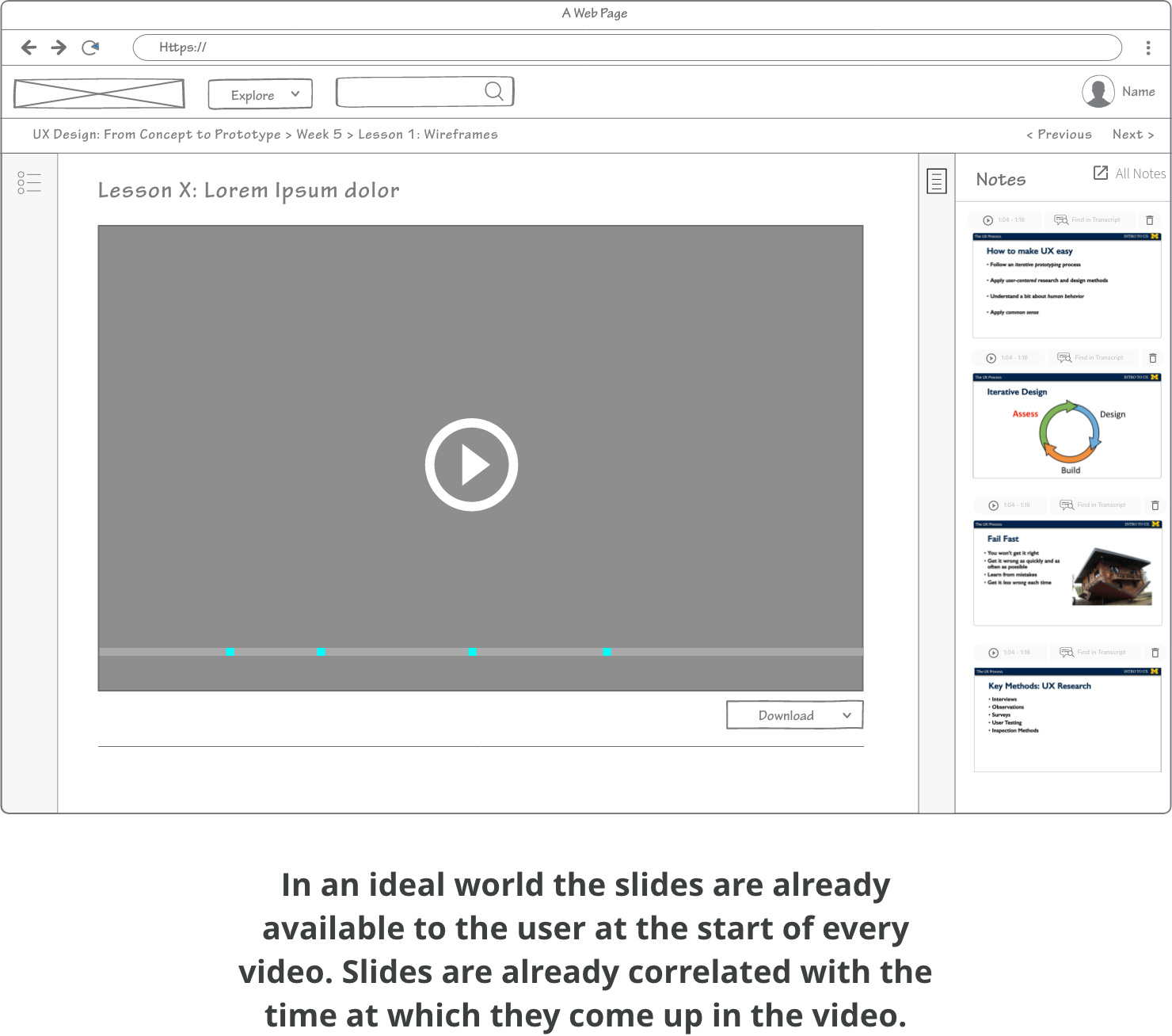
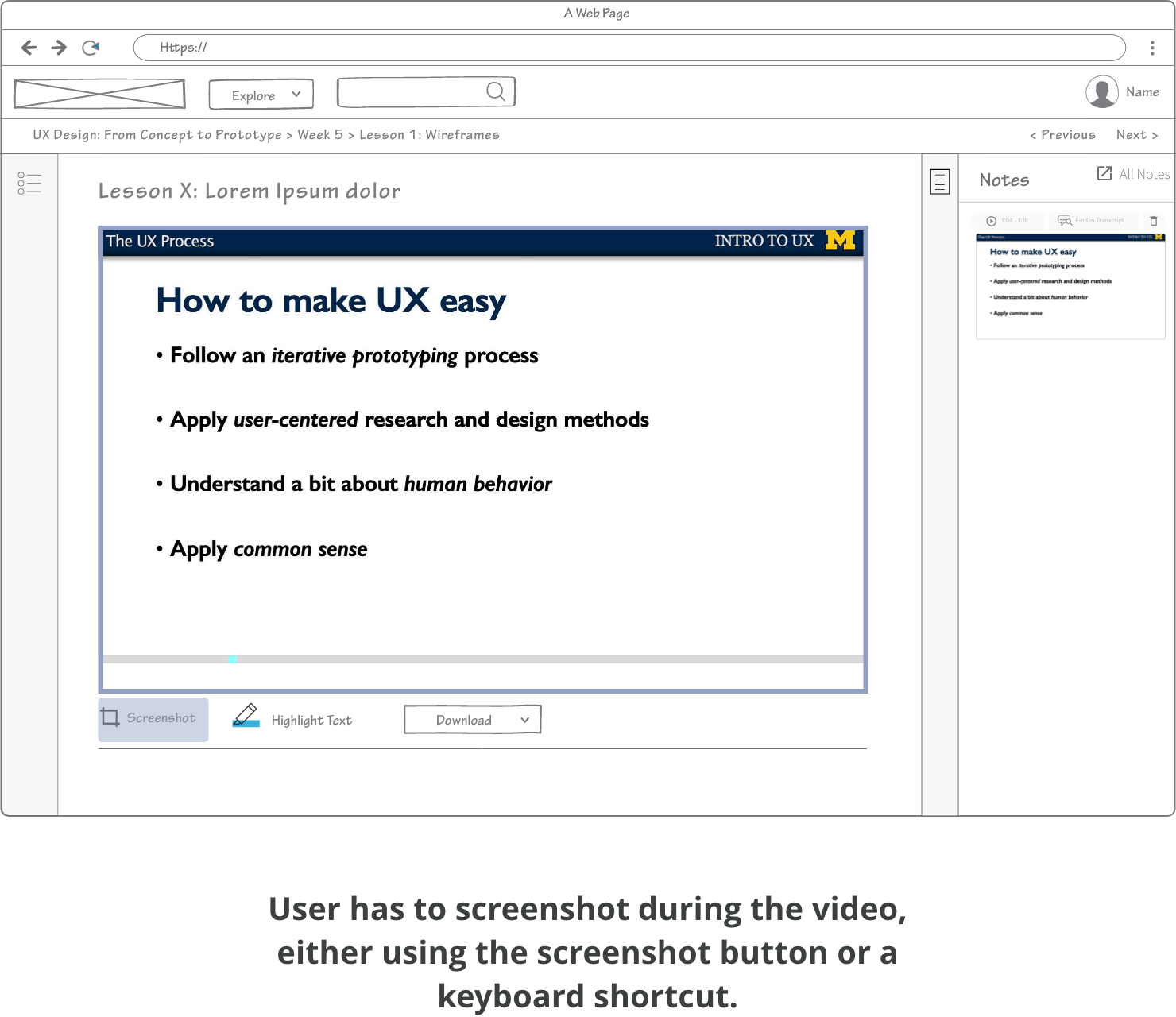
The second concept focused on emphasizing screenshots/slides and changing the visual presentation of the note items on the Notes Panel. Visibility of the information on the slides became a priority. In an ideal world the slides with their correlated times would already be available(prior to the user watching the video) but realistically speaking the user will have to screenshot the video for the slides.

Wireframes

Concept 1

Low-fi wireframes of concept one which allows the user to add, delete, and edit their own self-generated questions. Questions will be used by the system to later prompt the user during their next coursera session. Recall and interleaving information is an effective study method.

Interaction flow - add, delete, edit questions

Concept 2

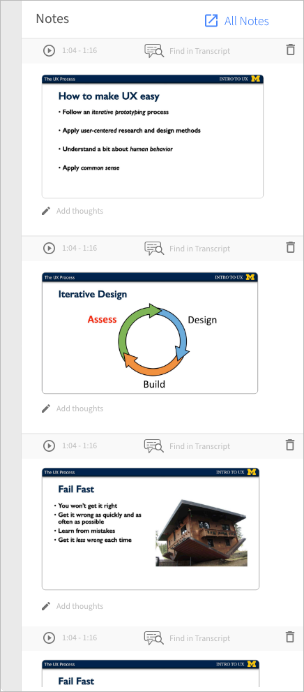
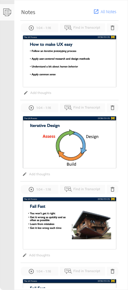
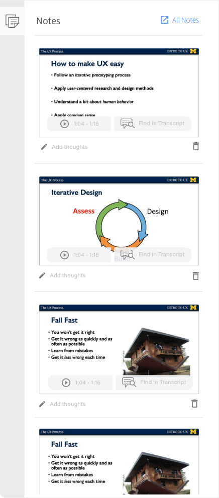
Designs of Concept 2, with an emphasize on powerpoint slides containing important summaries, instead of disembodied quotes. The slides are in chronological order as they would appear in the video. Buttons are placed in different locations.
I added a "Find in transcript button", to allow the user to easily find the reference in the text. Further the users eye will be more focused on the slides, due to the size being significantly larger than the buttons.

Design Outcome

Visibly Readable Slides
The user is able to easily look at the Notes Panels and browse through the screenshots. The screenshots are large enough for the user to read. Making skimming easy!

Note:  I only redesigned the right hand panel content. The rest of the items on the website remain as I found them on the original site.
Enlarged Image on Hover
For an even closer look, the image is enlarged on hover, over the video interface