Website Redesign
Overview
Problem / Challenge
The existing organization's website needs to be redesigned to better allow users to understand the organization’s mission and the course and product offerings. The information architecture and visual aesthetics of the website also need to be improved.
Description of Product
Toyzsteam is a minority owned organization whose goal is to inspire students via their Course and E-learning game offerings. Though the offerings are open to all, the target user is underrepresented minorities aged 11-18. The current website:
Toyzsteam.comwww. Toyzsteam.comScope
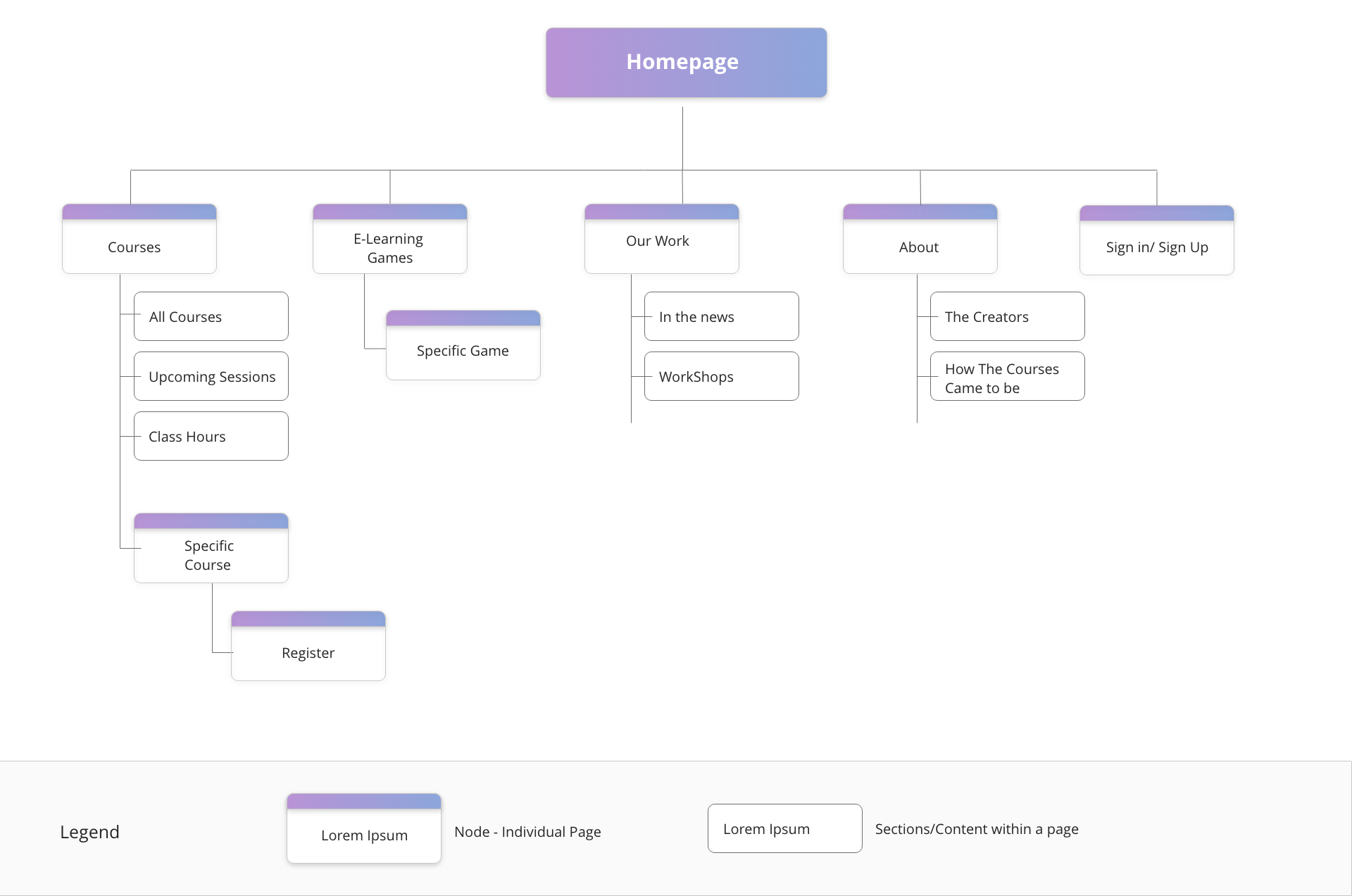
The scope of this project is to re-design two pages of the Toyzsteam website, which include:
Design Thinking Process
Design Outcome
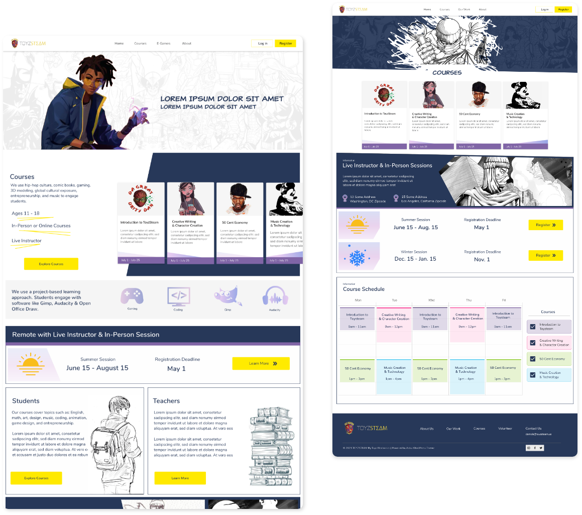
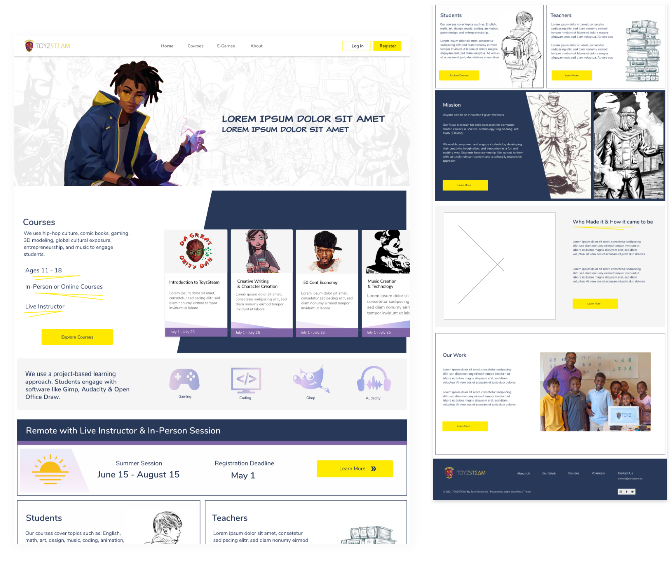
Home Page
The homepage strives to engage the minority and adolescent target audience. It has a playful undertone. The courses are featured above the fold so the user has a clear understanding of what the organization offers.
Note: Pictures are placeholders, artwork attributions can be found at the end of this webpage.
Courses Page
Upon clicking “Courses” on the navigation bar or the “Explore Courses” button the user is taken to the page displaying all the available courses. In addition the Courses page displays information regarding the upcoming course sessions dates, and the hours in which the courses take place
Note: Artwork was created by the original Toyzsteam creators. Other artwork was found on the internet, artwork attributions can be found at the end of the page
Research
I started with narrowing down what the exact issues are with the current website, via a heuristic evaluation and user testing. Then proceeded to look for inspiration and conventions for the website content, layout and structure via a competitive analysis.
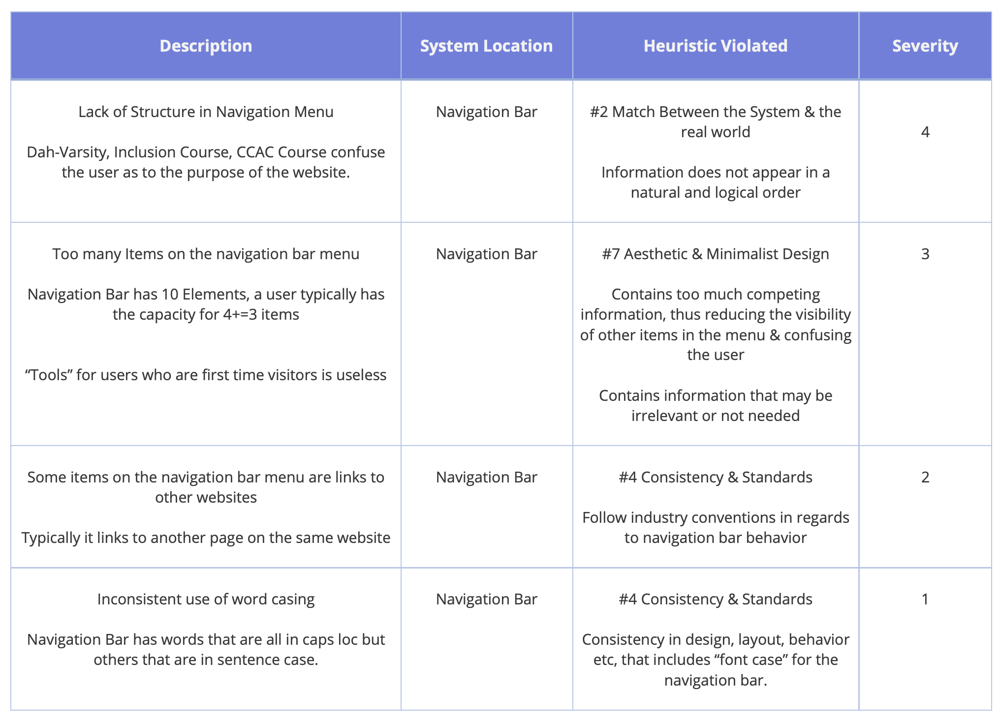
Heuristic Evaluation
Based on Jakob Nelson’s 10 Usability Heuristics for User Interface Design I pinpointed issues with the current website. I also took into consideration the Guidelines from “Designing with the Mind in Mind”.
Homepage
Current toyzsteam website
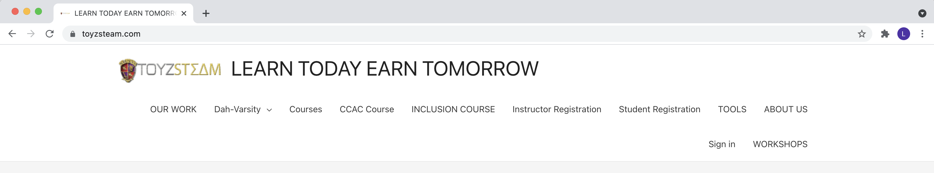
Navbar
Current navigation bar Toyzsteam website
User Testing
Users where asked to navigate from the home page to an individual course page. Some users could not find an informative description of courses because the home page course cards lead to a practically empty page. While if the user navigated to the all courses page from the navigation bar they would be directed to a page that showed more information.
Other users where able to finally find a page with more information regarding the single course, but expressed confusion as to what the course offered and via what platform. The user test helped inform me that it was necessary to change the information architecture of the site and that the single course page was uninformative.
Competitive Audit
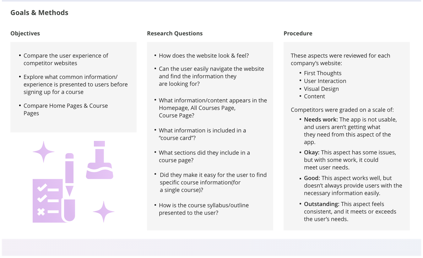
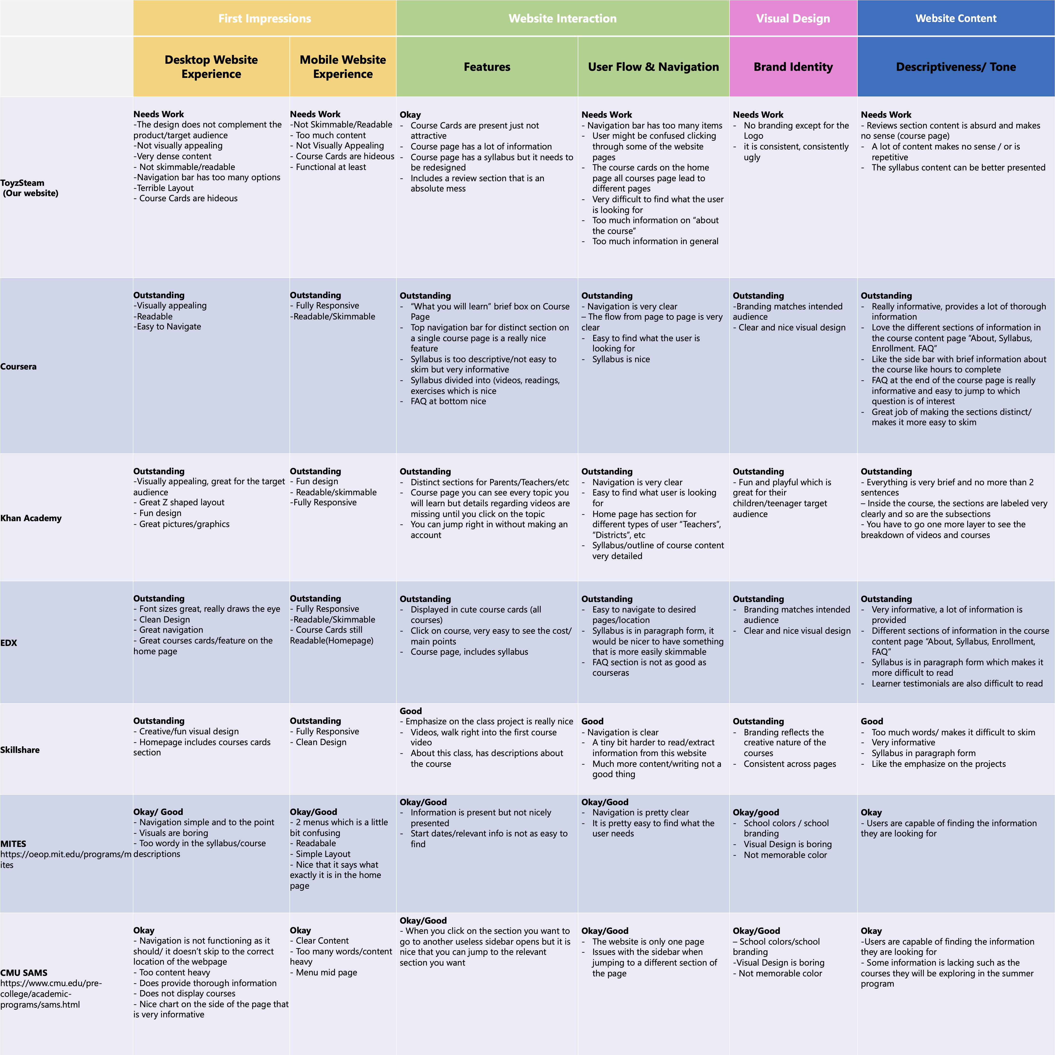
Takeaways from the competitive audit
Make it easy to navigate the content heavy Course Page
As an outline/minimum important sections to include in the course page are:
“About, What you will learn, Syllabus, and Enrollment information”
Cost, Time Commitment are also common pieces of information that were included in (edx, coursera, skillshare, etc)
The Syllabus should be easy to skim
Aim for as few words as possible (2-7), like Khan Academy
Coursera, Edx, Skillshare was too content heavy
But still aim for students to understand what exactly they will be learning/doing
Emphasize projects
Prioritize minority target audience
Feature the courses on the homepage, above the fold
Home page sections should include:
Call to action for different end users: volunteers, students, teachers (Khan Academy, EDX)
Vision/mission statement (EDX, Khan Academy)
Remove Course Reviews (Course Page) on Toyzsteam
Reorganize the sections of the Current Course Page
About section should be significantly shorter
Emphasize “what they will learn”, EDX, Coursera, Skillshare all prioritized this at the top of the page
Aim for a playful & youthful visual design/aesthetic that speaks to the brand & target audience
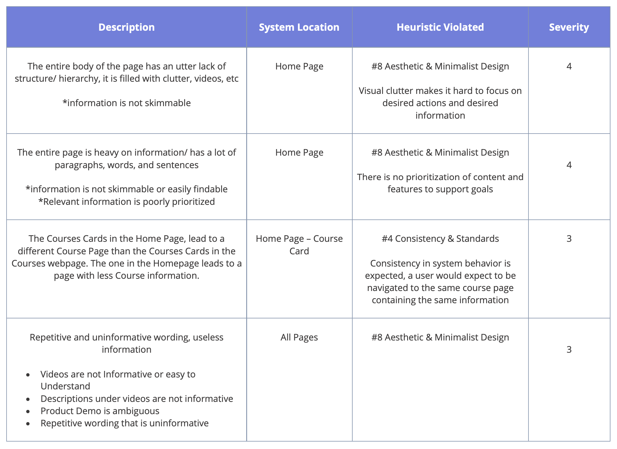
Summary of Issues
Its an ugly website
“Attractive things work better” Don Norman, Emotional Design
Lack of structure and visual hierarchy makes it difficult for users to quickly scan and comprehend the website
The contents of the page are not organized and prioritized by using size, prominence, and content relationships
Sections & Subsections are not labeled in a way to clearly identify its content
Navigation bar contains too many elements and elements that are irrelevant
Course Cards on Homepage lead to a page with no information, making it difficult for users to find info about the course
It is difficult for users to understand what they will learn from a course/ what skills they will develop
Finding information about what the company does is not easy to skim
There is no information regarding enrollment/ how it works/ is it an online course? Is it in person?
Design
Ideation
Brainstorming & Sketching
Based on the research, I decided to keep these things in mind while creating a solution:

Aim for a playful & youthful visual design
Changing the Information Architecture, which will reduce the number of items on the navigation bar menu
Home page should include at a minimum; courses above the fold, call to action for different end users, vision/mission statement
Course page should be easy to skim & include an additional nav bar, shorter "about" section, syllabus, FAQ
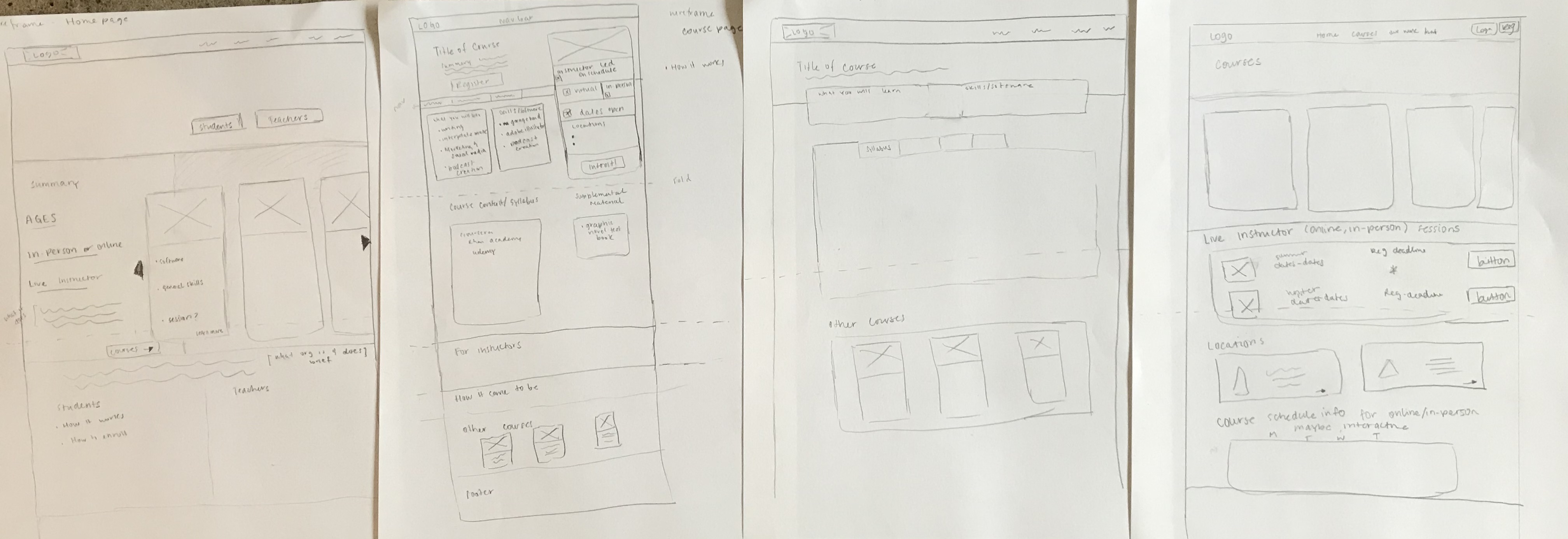
Low Fidelity Wireframes
I created low fidelity wireframes to brainstorm different layouts
Design Outcome
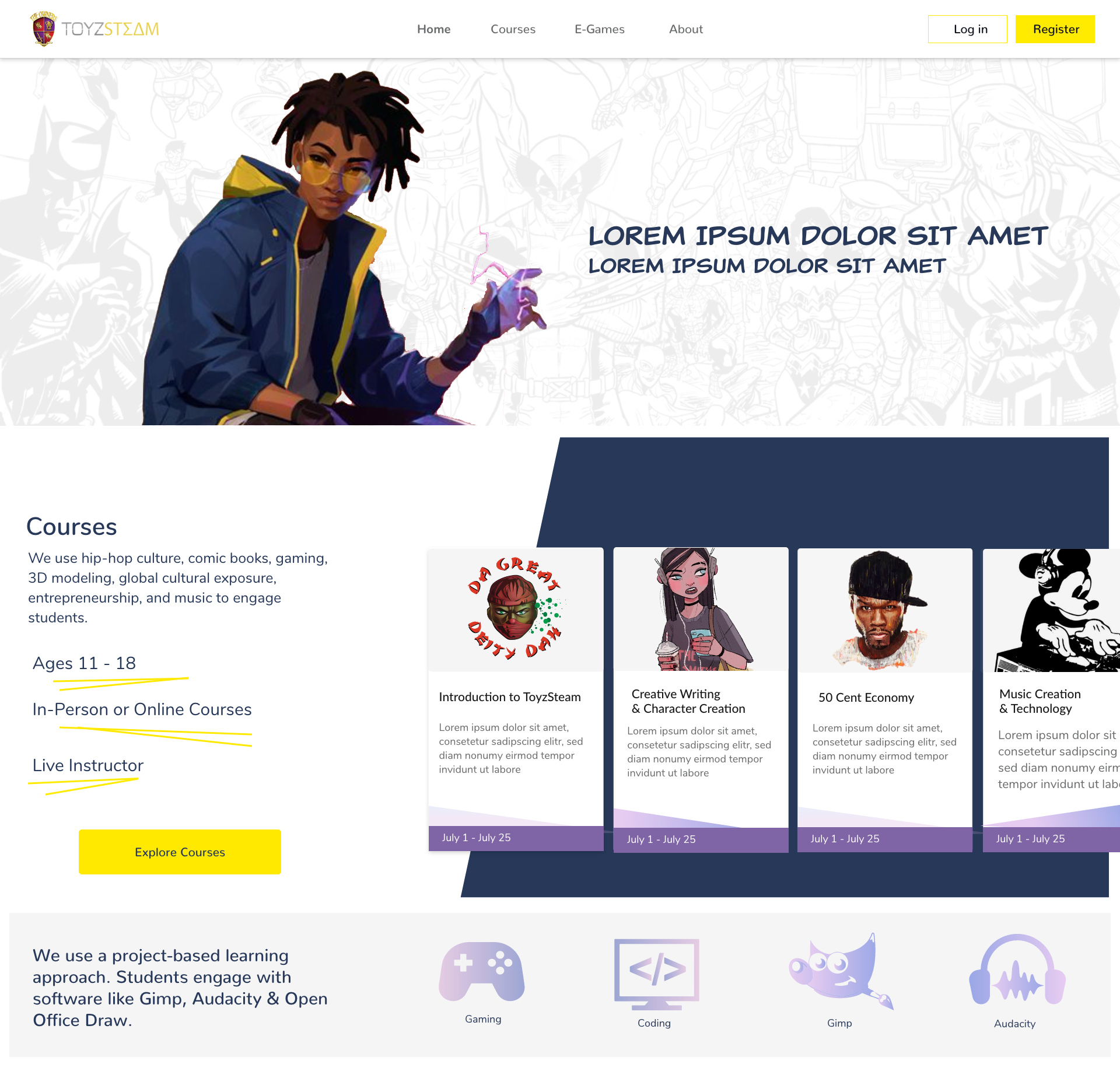
Home Page
The homepage strives to engage the minority and adolescent target audience. It has a playful undertone. The courses are featured above the fold so the user has a clear understanding of what the organization offers. It also features a call to action for students and teachers, along with a Mission and About section.
Note: Pictures are placeholders, artwork attributions can be found at the end of this webpage.
Courses Page
Upon clicking “Courses” on the navigation bar or the “Explore Courses” button the user is taken to the page displaying all the available courses. In addition the Courses page displays information regarding the upcoming course sessions dates, and the hours in which the courses take place
Artist Attributions
The artwork on the webpages serve as placeholders and were created by artists found on the internet. Some of the artwork can be found on the existing Toyzsteam website and was created by the creators.
https://www.pinterest.com/pin/701787554435431550/
thenounproject.com
toyzsteam.com